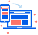
RESPONSIVE DESIGN
We have a team of experts ready to dynamically readjust content and imagery, ensuring that the website is effective, easy to use on any device and any size screen. We make sure to place each element on your site in the best position to make it easy for the visitor to find your best offers and take action.
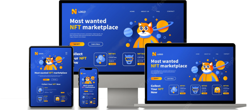
Responsive Web Design
Responsive Web Design
Mobile First Approach
Content scaling, touch-screen gestures and device-specific keys – all this makes interaction with software on a mobile device completely different from that on a desktop computer. That’s why we tackle mobile and desktop design of your web solution as interconnected yet different entities. Starting from mobile and proceeding with desktop design allows us to easily create web solutions, which fully match in the visual style but have independent user experience that feels natural on all devices.

Driven By Your Business Objectives
ScienceSoft’s design team always combines your individual business requirements with the latest responsive website and web portal design trends. Working in close cooperation with you, we discuss all your workflows and business goals before the project launch. This way, we can deliver web designs that meet your most prioritized marketing objectives.

Ensured Results
We let you picture the business outcomes of our responsive web design services early on in the project. To provide you with factual and reliable data on the prospective results – such as visitor session time, user engagement rate and conversions – we conduct comprehensive market studies, business analysis and user research.
Make a Responsive Web Design
As many as 70% of users don’t complete their purchases on websites when viewing them on mobile devices because of impeding mobile UX. Moreover, 94% of users say they do not trust a company behind a website or a web portal with poor mobile design and choose to switch to a competitor instead. While you are still assessing the reasonableness of your investment, responsive web design has already become one of the major conditions for the success of your digital venture.
Why Responsive Design
Why Responsive Design
What is Responsive Design?
Responsive web design (RWD) or responsive design is an approach to web design that aims to make web pages render well on a variety of devices and window or screen sizes from minimum to maximum display size to ensure usability and satisfaction. A responsive design adapts the web-page layout to the viewing environment by using techniques such as fluid proportion-based grids, flexible images, and CSS3 media queries.
Define Typography
Generally, web developers define font sizes with pixels. These work on static websites, but responsive websites need a responsive font. Font size must change with respect to parent container width. This is necessary to make typography adjust to screen size and be easily readable on multiple devices. In the CSS3 specification, look for the unit named rems. It is similar to the em unit but acts relative to the HTML element.
Adjusting Screen Resolution
With more devices come varying screen resolutions, definitions and orientations. New devices with new screen sizes are being developed every day, and each of these devices may be able to handle variations in size, functionality and even color. Some are in landscape, others in portrait, still others even completely square. As we know from the rising popularity of the iPhone, iPad and advanced smartphones, many new devices are able to switch from portrait to landscape at the user’s whim. How is one to design for these situations?
Resolution
Best services Competitive rates We are always happy to assist. We believe in Partnership and sharing ideas and Innovation & quality We provide user friendly interface(GUI) and services. The majority of our new clients are referred to us by existing clients A good indicator of their satisfaction with our service. Just give a try with our service, we promise to delight you.

10+
Years Experience
40+
Engineering Team
50+
Mobile Apps Developed
151+
Clients Served
500+
Success StoriesInterested in working with us?
Let's build, launch & grow


WE GUARANTEE 100% SECURITY OF YOUR INFORMATION
We Will Not Share The Details You Provide Above With Anyone. Your Email Won’t Be Used For Spamming.